EN
EN JP
JP KR
KR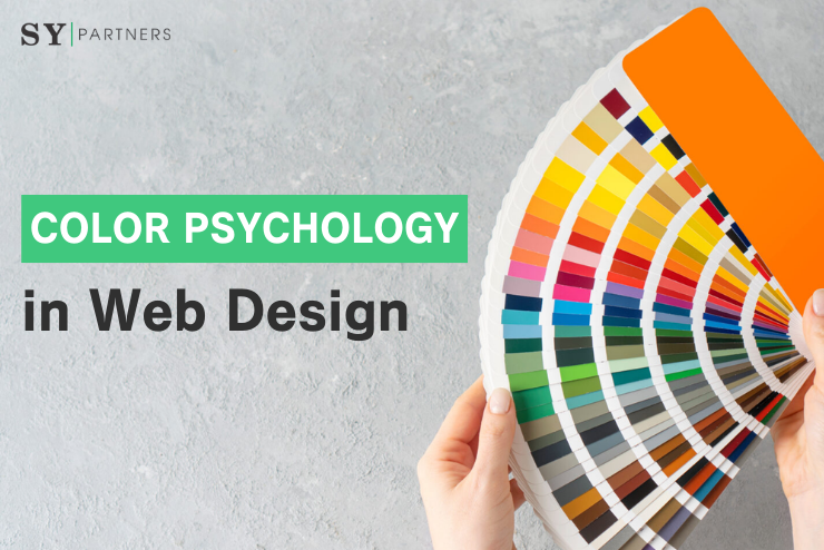
Color Psychology in Web Design: Strategies and Applications to Capture Users’ Hearts
In web design, color is a strategic tool that deeply influences users’ emotions and behaviors. Color psychology is the study of how colors affect human psychology and decision-making, and it is indispensable for optimizing user experience (UX) and enhancing engagement. The right choice of color shapes the first impression of a site, strengthens the brand message, and effectively guides user actions.
This article explains in detail the basics of color psychology, its concrete applications in web design, and differences in cultural interpretations of colors. It provides expert knowledge and techniques useful for both beginners and professional designers, exploring from multiple perspectives how color choices impact user experience and brand perception. By strategically leveraging the power of color, you can create compelling web designs that truly capture users’ hearts.
1. What is Color Psychology?
Color psychology is the study of how colors affect human emotions, cognition, and behavior. Colors work directly on the brain through vision, triggering specific feelings and reactions.
For example, warm colors give an energetic and passionate impression, while cool colors evoke calmness and trust. These effects vary depending on personal experience and cultural background, so in web design it is necessary to deeply understand the characteristics of the target users.
The purpose of color psychology in web design is to appeal to users’ psychology and effectively achieve the goals of the site (e.g., purchase, registration, information acquisition). Color is a strategic element that strongly influences users’ first impressions and behaviors within the site.
The Importance of Color in Web Design
In web design, color is a crucial element for shaping user experience and conveying brand messages. Appropriate color choices affect not only the site’s visual appeal but also its functionality and effectiveness. The following table summarizes the major roles of color:
| Role | Effect |
|---|---|
| Forming the first impression | Captures user interest, conveys trust and professionalism |
| Strengthening the brand | Consistent color use increases recognition and creates memorable designs |
| Guiding behavior | CTA and link colors encourage actions such as clicks or sign-ups |
| Visual comfort | Proper contrast ensures readability and provides a comfortable experience |
Color selection should be based on strategic intent. For example, blue can be used on trust-focused sites, while red or orange is effective in e-commerce sites to emphasize urgency.
2. The Psychological Effects of Color
Colors are not just visual elements but key factors that directly affect users’ emotions and actions. Understanding and applying the psychological effects of color in web design enables the creation of more effective and engaging designs.
2.1 Psychological Impact of Major Colors
Each color has unique psychological effects and plays an important role in design choices. The following table summarizes the psychological effects of major colors and their applications in web design:
| Color | Psychological Effect | Application in Web Design |
|---|---|---|
| Red | Passion, energy, urgency | Emphasize urgency in CTA buttons and sale banners |
| Blue | Trust, calmness, professionalism | Build trust in corporate and financial websites |
| Green | Nature, health, growth, relaxation | Strengthen natural impressions for eco-related or health food sites |
| Yellow | Optimism, happiness, creativity | Use as an accent in children’s or creative brand sites |
| Black | Luxury, sophistication, modernity | Apply in luxury brands or minimalist designs |
| White | Cleanliness, simplicity, openness | Highlight content in medical or tech sites |
| Pink | Kindness, friendliness, femininity | Apply in women’s brands or approachable designs |
| Purple | Creativity, nobility, mystery | Emphasize uniqueness in art or creative brands |
| Orange | Energy, friendliness, encouragement to act | Promote action in e-commerce or youth-oriented sites |
| Gray | Neutrality, sophistication, balance | Use as a background or secondary color for a calm, modern impression |
| Brown | Warmth, reliability, naturalness | Create stability in outdoor or organic brands |
By understanding these, designers can strategically build color schemes.
2.2 Impressions Formed by Color Combinations
Color combinations go beyond the effects of single colors and strongly shape users’ impressions and experiences. Understanding color wheel–based palettes allows designers to create harmonious designs.
| Combination Pattern | Features | Effect | Application Scene |
|---|---|---|---|
| Monochromatic | Use shades of the same hue | Simple, unified impression | Corporate sites, portfolios |
| Complementary | Use opposite colors (e.g., blue & orange) | Strong contrast, attracts attention | CTA buttons, banners |
| Analogous | Use adjacent hues (e.g., purple & pink) | Harmony, relaxed impression | Beauty sites, health sites |
| Triadic | Use three evenly spaced colors (e.g., red, blue, yellow) | Balanced, lively impression | Creative brands |
Complementary schemes emphasize CTAs, while analogous schemes bring harmony. Choosing palettes requires aligning brand goals with user psychology.
3. The Role of Color in Web Design
Color is not mere decoration but a key factor influencing brand perception, user behavior, and information communication. Proper color choice and usage maximize brand appeal and enhance user experience.
3.1 Building Brand Identity
Color visually expresses brand personality and leaves lasting impressions. A consistent palette strengthens recognition and builds trust.
| Item | Detail |
|---|---|
| Target audience | Pink/orange for youth, blue/gray for business |
| Brand values | Green/brown for environmental awareness, purple/black for luxury |
| Consistency | Apply the same palette across websites, SNS, logos, and ads |
Example: Green & brown for eco-friendly brands reinforce sustainability values.
3.2 Influence on User Behavior
Color choices directly affect actions like clicks, purchases, and registrations. CTA button colors in particular greatly influence conversion rates.
| Color Group | Effect | Application Example |
|---|---|---|
| Warm colors (red, orange) | Urgency, excitement | “Buy Now” buttons in e-commerce |
| Cool colors (blue, green) | Trust, reassurance | Registrations on finance/education sites |
| Intermediate (pink, purple) | Friendliness, creativity | Beauty or art sites |
Example: A financial site using a blue CTA on white background emphasizes trust and boosts sign-ups.
3.3 Establishing Visual Hierarchy
Color helps users navigate smoothly by establishing a hierarchy.
| Method | Detail |
|---|---|
| Contrast | Bright colors for headings/CTAs, muted tones for backgrounds |
| Accent colors | Purple or orange for links and icons |
| Color priority | Red/orange for main CTAs, gray for secondary items |
Example: A news site uses purple for headlines and orange for CTAs to naturally guide attention.
4. Color and Culture
Color meanings differ across regions. Considering cultural context is crucial in global web design.
4.1 Cultural Differences
| Color | West (US, Europe) | East Asia (Japan, China) | Middle East |
|---|---|---|---|
| Red | Passion, love, danger | Happiness, prosperity, celebration | Danger |
| White | Purity, cleanliness, weddings | Loss, death, funerals | Purity |
| Pink | Love, femininity | Youthfulness, friendliness | Femininity |
Example: In Japan, red symbolizes celebration; in Europe, pink shows friendliness.
4.2 Global Web Design Considerations
| Strategy | Detail |
|---|---|
| Cultural research | Study color meanings beforehand |
| Neutral colors | Blue and green give positive impressions across cultures |
| Regional customization | Red/pink for Asia, blue/white for Europe |
Example: Travel site — red/pink for Asia pages, blue/white for Europe pages.
5. Practical Color Schemes
5.1 Color Wheel & Theory
| Pattern | Description |
|---|---|
| Monochromatic | Shades of one hue, unified impression |
| Complementary | Opposites for strong contrast |
| Analogous | Adjacent hues (e.g., purple & pink) for harmony |
| Triadic | Three evenly spaced hues for balance |
Tools like Adobe Color generate harmonious palettes.
5.2 Accessibility
| Item | Detail |
|---|---|
| Contrast ratio | Maintain at least 4.5:1 for text/background |
| Color blindness | Avoid red-green combos, use shapes/patterns |
| Visual clarity | Adjust font sizes, spacing |
Example: Education sites use 5:1 ratio, underline links for clarity.
5.3 Optimizing for User Psychology
| Color | Effect | Example |
|---|---|---|
| Pink | Friendliness | Women’s brands |
| Purple | Creativity, nobility | Art-related sites |
5.4 Contrast & Balance
| Item | Detail |
|---|---|
| Color strength | Use strong colors sparingly, soft tones as base |
| Space usage | Spread colors evenly to avoid overload |
| Ratio rule | Apply the 60-30-10 rule |
Example: Black & white ensure readability, gray & white give elegance but require accessibility care.
5.5 Dynamic Colors & Interactivity
| Item | Detail |
|---|---|
| Color changes | Adjust brightness on hover |
| Animation speed | Smooth 0.2–0.3 seconds |
| Consistency | Apply rules across interactive elements |
6. Case Studies in Color
| Case | Analysis |
|---|---|
| Minimalist | Apple: white background + black/gray + blue CTAs → clean, trustful |
| Vivid | Spotify: green brand color + black/white base + pink/orange accents → energetic |
| Cultural | Airbnb Japan: red/pink accents + white base → happiness & friendliness |
| Emotional | Beauty brand: pink & purple emphasize kindness & creativity, white background enhances content |
| Accessibility | Education platform: black/white high contrast + blue CTAs + underlined links → clear & inclusive |
7. Tools & Resources
7.1 Tools
| Tool | Description |
|---|---|
| Adobe Color | Generates palettes from color wheel |
| Coolors | Random palette generation & customization |
| Canva Palette Generator | Extracts palettes from images |
| WebAIM Contrast Checker | Tests contrast ratio |
7.2 Resources
| Resource | Description |
|---|---|
| Dribbble | Browse latest palettes/designs |
| Behance | Creative web design case studies |
| Awwwards | Award-winning website inspiration |
Conclusion
Color psychology in web design significantly influences user emotions and behaviors. Understanding the psychological effects of colors and choosing palettes aligned with the target audience and cultural context enhances UX and helps achieve site objectives.
Using color wheels and accessibility standards ensures inclusive design. For designers, color choice is not just aesthetic but a strategic decision. Leveraging the power of color strengthens brand messages and creates memorable web experiences.
Strategically applied color psychology is the key to effective web design.