EN
EN JP
JP KR
KR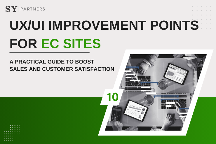
10 UX/UI Improvement Points for EC Sites|A Practical Guide to Boost Sales and Customer Satisfaction
An EC site is not just a place to sell products, but a stage to provide the “shopping experience itself” to users. Modern users place importance not only on products but also on the ability to shop without stress, and the quality of UI/UX directly affects sales and brand image.
Even if the products or prices are attractive, if the site is difficult to use, users will leave immediately. Conversely, in sites with excellent UX/UI, users naturally feel, “I want to shop here again,” which increases repeat rates and leads to long-term growth.
In this article, we explain 10 UX/UI improvement points that EC site operators can easily incorporate into practice. We go beyond simple design changes to deeply explore “why it’s necessary” and “how to improve it.”
1. Intuitive and Easy-to-Understand Navigation Design
Navigation is the “map” of an EC site. If users get lost here, no matter how attractive the products are, they will drop out along the way. The category structure must match the “way of searching” users have in mind.
Especially in EC sites with many products, if categories are too complicated, users quickly become confused. More menu items are not necessarily better — it is important to narrow them appropriately and separate the roles of the top menu and side menu.
| Problem Before Improvement | Effect After Improvement |
|---|---|
| Overly complex and deep category structure | Simple and intuitive, users reach desired products quickly |
| Overloaded global menu | Place only main categories, reduce stress |
| Disorganized side menu | Users can smoothly narrow down according to their purpose |
Navigation improvement directly leads to “not letting users get lost.”
2. Implementation of a Powerful Search Function
The search function is the “fastest shortcut” for users. Especially for visitors with a specific purpose, the accuracy and usability of search strongly influence purchase intent.
- Provide suggestions while typing with auto-suggest, reducing effort.
- Offer advanced filtering (price range, size, stock, etc.) so users can efficiently find products that fit their needs.
- Use search history and popular keywords to improve the repeat experience.
| Search Improvement Function | Effect on User Experience |
|---|---|
| Suggest display | Shortens search time, reduces confusion |
| Filter search | Quickly selects products that fit user’s conditions |
| Search history | Smoothly rediscover products on revisit |
| Popular keyword display | Stimulates purchase intent by referencing others’ interests |
Search is the most important point to optimize “product discovery.”
3. Mobile Optimization
Today, the majority of EC site access is via smartphones. Inadequate mobile support leads to critical missed opportunities.
Simply shrinking the PC layout makes touch operation difficult and significantly lowers UX. Buttons and links should be spaced for fingers, and a scroll-centered vertical design is required. Also, images and scripts must be lightweighted to improve loading speed.
| Item | Before Improvement | After Improvement |
|---|---|---|
| Layout | Shrunk PC version | Mobile-optimized design |
| Usability | Small, hard-to-press buttons | Finger-friendly UI |
| Loading speed | Easily delayed | Smooth with lightweighting |
Mobile optimization is the “standard of the era,” and neglecting it will leave you behind in competition.
4. Simplification of the Purchase Flow
The process after adding to cart is the most stressful moment for users. Too many input fields, complicated confirmation screens, and long steps — all are causes of abandonment.
The ideal is to complete purchase in “within 3 steps.” Features like automatic address input and saved payment methods make it even smoother.
If the purchase flow remains complicated, the cart abandonment rate will inevitably rise.
5. Improving Page Loading Speed
Among UX/UI improvements, page speed is the most immediately effective. Studies show that if loading takes more than 3 seconds, nearly half of users leave.
- Compress and optimize images and videos.
- Use CDN to efficiently deliver content.
- Remove unnecessary JavaScript and plugins.
Speed improvement directly connects to SEO, delivering significant benefits also in customer acquisition.
6. Use of Reviews and Testimonials
Users care strongly about “what others felt.” Therefore, review functions and star ratings are essential for UX improvement. Reviews with photos are especially persuasive and encourage purchase.
Furthermore, a Q&A function allows concerns before purchase to be resolved in real time, increasing trust. Reviews are not mere decoration but an important “final push” for purchase decisions.
7. Personalized Recommendations
Users are tired of searching through countless products for what suits them. The solution is personalized recommendations using AI and machine learning.
- Suggest related products from browsing history.
- Propose bundle or upsell items based on purchase history.
- Update “recommended for you” in real time.
This reduces the burden of “searching” and provides the joy of “being found.”
8. Visualization of Security and Trust
Many users still feel uneasy about online payments. Strengthening security is important, but so is “how it is displayed.” Showing SSL certificates, payment brand logos, and security badges provides reassurance.
| Improvement Element | Effect on Users |
|---|---|
| Display of SSL certificate | Assurance of data protection |
| Payment brand logos | Visual guarantee of trustworthiness |
| Security badges | Alleviates anxiety, maintains purchase intent |
Lowering the psychological barrier of “being able to buy safely” leads to UX improvement.
9. Visually Appealing Product Pages
The product page is the “face” of an EC site. Poor quality photos and cluttered information undermine purchase intent.
- Use high-resolution photos, zoom, and 360° views.
- Convey usage and features with video.
- Keep layouts simple and use whitespace effectively.
Attractive product pages bring users closer to the experience of “holding the product in-store.”
10. Chatbots and Enhanced Customer Support
Providing an environment where “questions can be answered immediately” greatly improves UX. The ideal design combines chatbot first-level support with smooth handoff to human staff.
Many users leave due to unresolved small doubts before purchase. Having real-time support alone can significantly increase conversion rates.
Conclusion
Improving UX/UI of an EC site should not be viewed as one-off measures but as “comprehensive experience design.” From entrance improvements like navigation and search, to exit improvements like purchase flow and security, each effort accumulates to greatly enhance user satisfaction.
The most important thing is to think from the user’s perspective. If you were the user, where would you get lost, where would you feel uneasy, and where would you feel convenience? Continuously improving from that perspective is the key to surviving in the competitive EC market.
Frequently Asked Questions
Q1. What is the difference between UX and UI? Which should be prioritized when improving?
- UX (User Experience): The overall experience users get from using the site.
- UI (User Interface): The specific “look and operation” that shapes that experience.
For example, button color or size is UI, while the “reassurance of quickly finding the desired product” is UX.
As for priority: first identify UX issues (confusion, anxiety, stress), then adjust UI to solve them. In short, “UI improvement is a means to enhance UX.”
Q2. Is UX/UI improvement necessary for small EC sites?
Yes — it is even more important. Since small EC sites cannot easily compete with big players in product variety or price, they must differentiate with “ease of use” and “trust.”
For example, simply shortening the purchase flow can improve conversion rate. Adding reviews or chat support builds trust. For small sites, UX/UI improvements are the shortcut to stabilizing sales by increasing repeat customers.
Q3. How can the effects of UX improvements be measured?
The effects should be measured using both quantitative and qualitative indicators.
- Quantitative indicators: bounce rate, exit rate, average time on site, conversion rate, revisit rate
- Qualitative indicators: user interviews, surveys, review feedback
Example: if you shorten the purchase flow, track whether the cart abandonment rate decreases. Also ask users about “site usability” to uncover insights that numbers alone cannot show.
Q4. How much budget and resources should be allocated for UX/UI improvements?
It varies greatly depending on site size and scope. The realistic approach is to start small, measure effects, and expand gradually.
For example, start with high-impact areas such as “simplifying purchase flow” or “improving search.” If small investments in these bring results, then expand into mobile optimization or personalization.
The key is “not trying to improve everything at once.” By improving step by step and repeating measurement, you can maximize ROI.