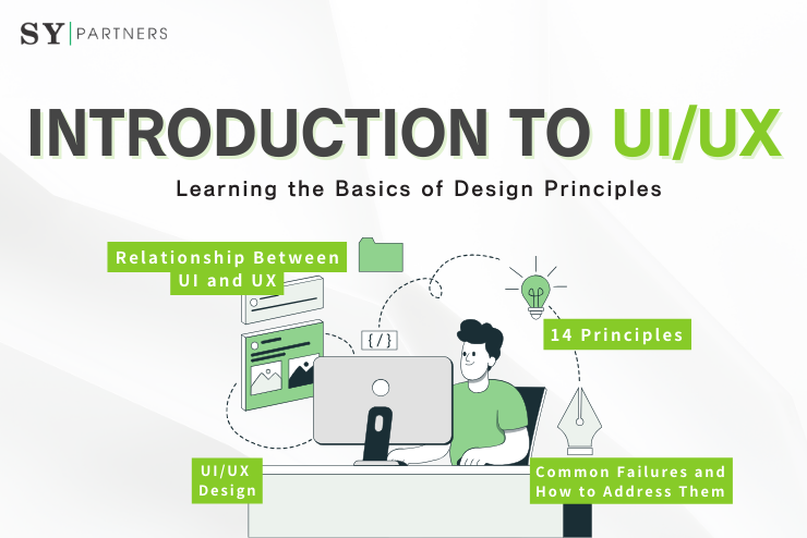
Creating a Satisfying UI/UX: Learning the Basics of Design Principles
Excellent UI/UX design greatly affects the usability and satisfaction of websites and apps. It’s not just about visual appeal; the structure and usability that allow users to achieve their goals without confusion are crucial. For example, even a visually attractive design can drive users away if information is hard to find or interactions are complex.
This article explains the basic differences between UI and UX, effective design principles, concrete methods, and development processes. It also provides practical knowledge for achieving user-preferred designs, incorporating hints on efficiency through AI utilization.
1. What Are UI/UX?
1.1 UI (User Interface)
UI refers to the elements that users directly see and interact with when using a website or app. It includes the design of buttons and icons, colors, fonts, layout, animations, and overall visual composition.
Main Elements:
- Shape and placement of buttons and icons
- Color and font selection
- Layout and animation effects
UI influences the first impression and provides visual appeal that encourages users to “want to use” the app while communicating brand trust and identity.
1.2 UX (User Experience)
UX refers to the “overall experience and satisfaction” users feel when interacting with a website or app. It emphasizes not only visual appeal but also usability, smooth interactions, and minimal stress.
Representative UX Elements:
- Ease of finding information (e.g., intuitive navigation)
- Ease of action (e.g., smooth flow from registration to purchase)
- Minimal discomfort (e.g., clear error messages)
UX directly impacts whether users can achieve their goals without problems, greatly influencing satisfaction and repeat usage.
1.3 Relationship Between UI and UX
UI is a critical component of UX, and the two are closely related. Even with a beautiful UI, poor usability will damage UX.
Examples:
- A sophisticated EC site with a complex purchase process may cause users to leave.
- Conversely, a simple UI with excellent UX can provide high user satisfaction.
Recently, AI-assisted tools such as Figma have improved efficiency in UI design and UX optimization.
2. 14 Principles for Satisfying UI/UX Design
To achieve highly satisfying UI/UX, it’s important to understand the following 14 principles and incorporate them into the design process.
2.1 Put the User at the Center
Design should always be created from the user’s perspective. User research is essential to understand user needs, expectations, and behavior. For instance, on an e-commerce site, users may strongly need to “find products quickly,” so designing intuitive navigation to meet this need is crucial.
2.2 Strive for Clarity
Aim for a UI that users can understand at a glance. Clear labeling, highly visible CTA (Call to Action) buttons, and intuitive icons are effective. AI analysis tools (e.g., Hotjar) can help identify where users become confused.
2.3 Minimize Actions and Steps
Reduce the number of steps or interactions (e.g., clicks or input) required for users to achieve their goals. For example, limiting a purchase process to three steps can reduce cart abandonment. AI-assisted form optimization tools can help design minimal-input forms.
2.4 Aim for Simplicity
Focus on essential information and elements, creating a simple, refined layout that reduces cognitive load. Excessive decoration or complex UI may cause confusion. Prototyping in tools like Figma can help verify designs.
2.5 Maintain Consistency
Consistency in colors, fonts, button styles, tone, and other elements across all pages lowers learning costs and increases trust. Implementing design systems like Google’s Material Design allows efficient management of consistency.
2.6 UI Design Should Be “Invisible”
Excellent UI allows users to operate naturally without consciously thinking. For example, buttons should look and feel “pressable.” AI can analyze user behavior patterns to support more natural and intuitive UI design.
2.7 Provide Useful Feedback
Give immediate and helpful feedback for user actions. Examples include loading indicators after clicks or completion messages. AI chatbots can provide real-time support.
2.8 Reduce Cognitive Load
Simplify complex information and choices to lessen cognitive load. For example, product filters on e-commerce sites should be simple. AI data analysis can prioritize information most important to users.
2.9 Ensure Accessibility
Design should accommodate users with color vision deficiencies or visual impairments. High-contrast colors and screen reader compatibility are important. AI tools (e.g., Accessibility Insights) can automatically perform accessibility checks.
2.10 Reflect User Feedback in UI
Actively incorporate user feedback (e.g., reviews, inquiries) into UI. For instance, if users report difficulty using the search function, relocate the search bar to a more prominent position. AI chat tools can efficiently collect user opinions.
2.11 Provide Flexibility
Design should accommodate a range of users from beginners to advanced. For example, advanced settings can be hidden by default and shown only when needed. AI personalization can suggest optimal UI for each user.
2.12 Clarify Visual Hierarchy
Visually organize information by priority and emphasize important elements. For example, make the purchase button large with a prominent background color. AI-enabled design tools like Canva can efficiently optimize visual hierarchy.
2.13 Dialogs Should Lead to Completion
Pop-ups or error messages should clearly indicate the next action. Instead of “An error occurred,” provide specific steps like “Please try again” or “Resend,” preventing user confusion. AI can assist in improving error messages.
2.14 Provide Clear Next Steps
Clearly indicate what users should do next to avoid confusion and provide a smooth experience. For example, after purchase, display guidance like “Please check your order confirmation email.” AI analysis can identify dropout points and suggest appropriate next actions.
3. Concrete Methods for UI/UX Design
To achieve satisfying UI/UX design, it is essential not only to understand theory but also to utilize concrete methods applicable to real projects. Here, we introduce three representative approaches.
3.1 User Research and Prototyping
Without understanding users’ real challenges and needs, good UI/UX cannot be created. The first step is user research. Use interviews, surveys, and observation to uncover behavior patterns and expectations. AI tools (e.g., ChatGPT) can efficiently help with designing questions and analyzing responses.
Next, prototyping involves creating wireframes or interactive mockups using tools like Figma or Adobe XD. This allows early verification of how users actually interact. For example, if feedback indicates “the purchase button is hard to find,” it can be corrected during the design phase, preventing rework in later stages.
3.2 Quantitative Analysis with Heatmaps and Analytics Tools
Relying solely on intuition or experience has limits. It is important to visualize user behavior using heatmaps and analytics tools and evaluate it quantitatively. Tools like Hotjar or Microsoft Clarity allow you to visually see where users click and where they drop off.
Google Analytics can analyze page-specific metrics such as time on page and conversion rates (CVR). AI-powered analytics tools can automatically extract reasons for user drop-off and suggest improvements. Data-driven improvement is far more reliable and reproducible than intuition.
3.3 AB Testing for Outcome Verification
Ultimately, the effectiveness of a design is determined by user response. AB testing scientifically evaluates its impact. For example, testing two CTA labels—“Buy Now” vs. “Add to Cart”—to see which contributes more to CVR.
AB testing can also quantify the effect of button color, placement, and design changes. AI-powered tools like Optimizely can automate test design and statistical analysis. Collaborating with the marketing team and making data-driven improvements is the modern standard for UI/UX enhancement.
4. Development Process for Successful UI/UX Design
Achieving satisfying UI/UX requires more than relying on intuition or design sense. Systematically following clear steps is key to success. Below are six major steps that can be applied in practice.
4.1 Understanding Users (Research & Interviews)
The first step is to understand the users’ essential needs and behavior patterns. Define personas, conduct interviews and surveys, and clarify user expectations and challenges. AI tools (e.g., ChatGPT or AI aggregation tools) can efficiently design surveys and extract insights in a short time.
4.2 Information Architecture (Prioritizing and Organizing Information)
Arrange important information so that users can find it easily and avoid confusion. For example, on an e-commerce site, “product categories” and “price filters” can be fixed at the top so users can quickly reach their desired products.
This step forms the backbone of UX, so prioritize meaning and flow of information over visual design.
4.3 Wireframe Design (Visualizing Structure)
Before adding visual elements, create wireframes using tools like Figma. Define UI structure, page transitions, and user flows, confirming functionality and navigation paths.
Reviewing with stakeholders at this stage greatly reduces rework after visual design begins.
4.4 Visual Design (Reflecting Brand Tone and Style)
Consistently apply brand colors, fonts, and styles to provide a unified impression to users. AI design tools (e.g., Canva AI) can automatically generate color schemes and layouts aligned with brand guidelines, improving efficiency.
4.5 Prototyping and Testing
Create interactive prototypes and conduct user testing. Verify actual operation and identify where users get confused or drop off.
AI can assist by automatically analyzing test videos and extracting user response patterns, visualizing points for improvement.
4.6 Implementation and Continuous Improvement
Implementation is not the end. Continuously collect and analyze user behavior data using tools like Google Analytics or AI analytics tools to discover issues. Iteratively improve the design, evolving toward higher-quality UX.
Tips
Prioritizing visual design too early can risk breaking UX. Begin with user understanding and information architecture, building a solid foundation. Only then can you create a usable and memorable design.
5. Common Failures and How to Address Them
In UI/UX design, unintentional mistakes can compromise user experience. However, many of these issues can be prevented in advance. Here are ten common failures and specific remedies.
5.1 Overloaded Screens
Problem: Packing too much information onto a screen confuses users about what to do, leading to drop-offs.
Solution: Clarify the priority of elements and follow the “one screen = one goal” principle. Consider white space as part of information organization; proper use enhances readability.
5.2 Inconsistent UI Patterns
Problem: If button placement, navigation, or design varies across pages, users become confused.
Solution: Establish a design system or guidelines and enforce consistent UI rules across all pages. Maintaining familiar operation patterns improves UX.
5.3 Unclear Clickable Buttons
Problem: Links or buttons that look like plain text make users hesitate to interact.
Solution: Convey “clickability” visually. Use shadows, colors, or hover effects to help users intuitively identify actionable elements.
5.4 Insufficient Mobile Optimization
Problem: UI that is hard to use on smartphones increases abandonment, especially in e-commerce or form-heavy apps.
Solution: Adopt mobile-first design, positioning key elements within easy thumb reach and ensuring tap targets are appropriately sized. Small UX considerations can yield significant results.
5.5 Complex Navigation
Problem: Deep information hierarchies prevent users from reaching desired pages.
Solution: Use global navigation, breadcrumbs, and search features strategically. Follow the “3-click rule” (users should reach goals within 3 clicks) when designing navigation.
5.6 Lack of User Feedback
Problem: Users feel uncertain if nothing responds when they interact.
Solution: Provide immediate feedback via visual cues, sound, or vibration when buttons are pressed or pages load. Feedback improves both reassurance and usability.
5.7 Unhelpful Error Messages
Problem: Generic messages like “An error occurred” leave users unsure how to respond.
Solution: Clearly explain errors and provide cause + solution.
Example: “Password is too short. Please use at least 8 characters.”
5.8 High Cognitive Load
Problem: UI that requires learning before use is burdensome for users.
Solution: Aim for intuitive, learn-free design. Leverage common UI patterns and clear icons to reduce cognitive load.
5.9 Relying Solely on Color for Communication
Problem: Users with color vision deficiencies may not perceive distinctions if color alone is used.
Solution: Combine color with text, icons, and shapes to improve accessibility. This design benefits all users.
5.10 Releasing Without User Testing
Problem: Designing solely based on internal opinions often misaligns with user perspective.
Solution: Conduct user testing at the prototype stage, iterating based on actual behavior and feedback. This is the only way to create genuinely usable UI.
6. Summary
To achieve high-satisfaction UI/UX design, it is essential to balance functional beauty and usability. UI shapes the visual impression, while UX governs the quality of interactions and overall user experience. By keeping in mind the 14 fundamental principles—user-centered design, clarity, simplicity, and more—and leveraging user research, AB testing, and heatmaps, you can continuously implement data-driven improvements.
Additionally, incorporating AI tools can streamline research, prototyping, and data analysis, enhancing design precision. Designing to meet user expectations directly contributes to lower abandonment rates and higher conversion rates. Now is the time to review your UI/UX and aim to create web and app experiences that users truly choose and enjoy.


 EN
EN JP
JP KR
KR