 EN
EN JP
JP KR
KR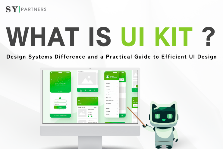
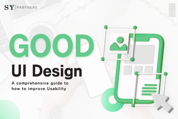
What Are UI Kits ? Design Systems Difference and A Practical Guide to Efficient UI Design
In modern digital product development, intuitive and consistent UI directly leads to improved UX and business outcomes. A UI kit is a tool that gathers reusable components such as buttons and icons, contributing to design efficiency. On the other hand, a design system is a comprehensive framework that integrates not only a UI kit but also guidelines and operational rules.
By leveraging these, teams can achieve faster development speed, smoother collaboration, and brand consistency. With modern tools like Figma and Adobe XD, AI-assisted auto-completion and variant management are now possible, making construction and operation even more efficient. This article provides a practical explanation from the basics of UI kits and design systems to implementation methods.
1. What is a UI Kit?
A UI kit is a toolset that consolidates components necessary for UI design, such as buttons, icons, and forms. It enables efficient creation of unified designs and smooth collaboration with development. Widely used in tools like Figma and Sketch, UI kits are especially effective in projects that demand rapid results.
1.1 Main Elements of a UI Kit
UI kits are often built based on the concept of atomic design. In other words, they are structured hierarchically from the smallest units (“atoms”) to more complex “molecules” and “organisms.”
Main elements included in a UI kit:
- Buttons: Primary / Secondary / CTA, with styles for hover, active, disabled states
- Icons: Generic icon sets for navigation, actions, and statuses
- Form elements: Text inputs, checkboxes, select menus, etc.
- Color palette: Main, accent, and neutral colors centered around brand colors
- Typography: Defined rules for font type, size, weight, line height, etc.
- Grid system: Column widths and spacing design to maintain layout consistency
These components are designed with defined state changes (e.g., color changes on hover), ensuring that anyone can create consistent UIs.
1.2 Benefits of Introducing a UI Kit
Using a UI kit significantly enhances both design and development efficiency. Key benefits include:
- Efficiency in design work: No need to design from scratch; existing components reduce work time
- Smooth collaboration with development: Shared components prevent misalignment between designers and developers
- Rapid prototyping: Enables quick construction of mockups and wireframes
- Ensured visual consistency: Naturally enforces adherence to brand guidelines, improving UX
- Improved scalability: Existing UI parts can be reused for new features or added pages
For example, if a startup needs to build an app prototype within a limited timeframe, using a UI kit allows delivery of high-quality output within days. With AI-assisted features in Figma such as smart animation, even dynamic prototypes can be built intuitively.
Thus, UI kits are indispensable for balancing efficiency and quality. However, for large-scale products or long-term operations, UI kits alone may not be sufficient. Next, let’s take a closer look at the more comprehensive design system.
2. What is a Design System?
A design system is a comprehensive rules framework that includes UI kits to maintain consistency between design and development. It integrates components, guidelines, principles, and documentation, functioning as a shared foundation for the entire team. For example, Shopify’s Polaris defines not only UI but also accessibility and content tone, supporting a unified UX.
2.1 Main Components of a Design System
Design system components:
- Visual language: Brand guidelines for colors, fonts, spacing, layout
- UI components: Reusable UI parts (including the UI kit)
- Tone & voice: Unified style for content expression
- Accessibility: Inclusive design (WCAG-compliant)
- Design tokens: Encoding design information such as colors and typography for code management
These are documented and shared within teams through tools (e.g., Storybook, Zeroheight).
2.2 Differences Between UI Kits and Design Systems
| Item | UI Kit | Design System |
|---|---|---|
| Definition | A collection of reusable UI components (e.g., buttons, forms) | A comprehensive framework including UI kits, guidelines, and operational rules |
| Purpose | Design efficiency, rapid prototyping | Ensuring consistency between design and development, long-term operation |
| Scope | Component-centered | Components, guidelines, documentation, principles |
| Use cases | Small-scale projects, one-off designs | Large-scale products, multi-team operations |
| Governance | Not required or minimal | Essential (operational rules and update management) |
Think of UI kits as “materials” and design systems as “a framework and culture.”
3. Relationship Between UI Kits and Design Systems
As digital products scale, simply having a set of components is not enough; a more systematic approach is required to maintain consistency and operational efficiency. Here, we clarify the relationship between UI kits and design systems and discuss their roles and limitations.
3.1 UI Kits as “Part of a Design System”
A UI kit is an important element of a design system, consisting mainly of UI components such as buttons, cards, and input forms. Designers and developers use these assets daily to maintain consistency and efficiency.
For example, Google’s Material Design includes Material UI, provided as a UI kit that anyone can use for unified components. A UI kit alone can handle many projects—especially small-scale or startup projects—enabling fast-paced design production.
Recently, tools like Figma’s AI plugins have made managing component variations and updates even easier.
However, a UI kit is still just a “parts collection.” Without guidelines or rules, maintaining consistency becomes difficult over time. That’s where a design system becomes necessary.
3.2 Why UI Kits Alone Are Limited
While convenient, UI kits alone often present challenges:
Lack of unified rules
Without design and implementation guidelines, each team member may interpret components differently, causing inconsistency.
Scalability limitations
As products and teams expand, maintaining overall consistency with just a UI kit becomes difficult.
Personalized maintenance
Updates and quality control become cumbersome without transparency on who made changes, when, and how.
For instance, if multiple designers independently use a UI kit, slight differences in colors or fonts may emerge, leading to an unnatural user experience.
To avoid such risks and enable long-term, organizational product operation, a design system with rules, principles, and philosophy is essential.
4. Use Cases for UI Kits and Design Systems
The use of UI kits and design systems varies depending on project size and phase. This section introduces specific scenarios for small- and large-scale products and explains how to differentiate their use.
4.1 UI Kit Use in Small-Scale Products
For startups and small-to-medium projects, starting with a UI kit allows for development focused on speed and efficiency. Use cases include:
Rapid prototyping
Build mockups or MVPs (Minimum Viable Products) quickly within limited resources.
Cost reduction
Utilize free or low-cost UI kits (e.g., Material UI) to cut design costs.
Operation by small teams
Even with few designers and engineers, consistent UI design is achievable.
In early phases, it’s effective to first launch products quickly with a UI kit, then gradually expand to a full design system as the business grows. Tools like Figma’s AI features (e.g., automatic variant generation) can further streamline kit creation and expansion.
4.2 Design Systems in Large-Scale Products
In large-scale contexts, a UI kit alone is insufficient. Companies operating multiple products or large-scale services need design systems. Use cases include:
Consistency through centralized management
Unify design and code across products, ensuring brand consistency.
Enhanced collaboration
Designers, developers, and marketers all refer to the same design guidelines.
High scalability
New features or products can reuse existing components and principles, avoiding redundant redesigns.
For example, Shopify’s Polaris supports unified UI across its entire EC platform, elevating user experience quality. Tools like Zeroheight automate documentation updates and sharing, reducing operational burden.
5. Steps for Introducing and Operating UI Kits and Design Systems
UI kits and design systems are not one-off efforts but ongoing assets that generate value through design, implementation, operation, and continuous improvement. This chapter outlines step-by-step processes for adopting them into projects.
5.1 Steps for Introducing a UI Kit
UI kits are relatively easy to adopt and are especially beneficial for improving speed and cost-efficiency in early project phases. The process includes component design, team operations setup, and AI tool utilization.
Steps:
- Component design and organization
Classify UI elements systematically based on atomic design and design states for each. - Management in design tools
Use Figma or Adobe XD cloud libraries for team-wide sharing and management. - Team rollout and operation rules
Provide training and establish workflows to prevent personalization and ensure consistency. - Use of AI tools
Automate layout adjustments and component generation with Figma AI plugins. - Accessibility considerations
Incorporate rules for color contrast, font sizes, etc., to meet accessibility standards. - Create usage guides
Document simple usage rules for onboarding new team members. - Implement version control
Record update histories and changes, ensuring rollback capabilities when needed. - Introduce a feedback loop
Continuously improve UI kits based on usage data and issues.
5.2 Steps for Building a Design System
Building a design system requires not only component setup but also cross-organizational structures and sustainable operations. This includes principle formulation, code integration, multilingual adaptation, and KPI measurement.
Steps:
- Formulate principles and guidelines
Define visual rules such as brand colors, typography, and spacing. - Documentation management
Use Storybook or Zeroheight for systematic management of principles and UI specifications. - Build a DesignOps structure
Clarify roles between designers and engineers for cross-functional collaboration. - Continuous operation and improvement
Update systems based on user feedback and design trends. - Component-code integration
Link with front-end frameworks (React, Vue) to eliminate design-implementation discrepancies. - Quality management and review system
Review new components to check quality and compliance. - Incorporate multilingual/multicultural support
For international expansion, consider flexible fonts, layouts, and RTL (right-to-left) support. - Design KPI and effectiveness measurement
Quantify impacts (e.g., development speed, consistency) to drive improvements.
6. Famous Examples of UI Kits and Design Systems
UI kits and design systems are actively used across industries. Understanding real-world examples helps in selecting and introducing systems tailored to your organization.
6.1 Examples of UI Kits
Here are four major UI kits. Choosing appropriately by product size and purpose can significantly improve design and development efficiency.
6.1.1 Material UI (Google)
Google’s Material UI is one of the most widely used UI kits. Based on React, it provides consistent component design aligned with Google’s design principles.
| Item | Content |
|---|---|
| Overview | React component library based on Material Design, offering abundant UI elements such as buttons and cards. |
| Features | Open-source, highly customizable, supports accessibility. |
| Use in UX | Web and mobile app UI design, multi-product development using common styles. |
| Recommended point | Free to use; easy integration with Figma and other design tools. |
Material UI ensures design quality and consistency across teams by adhering to Google’s guidelines.
6.1.2 Ant Design (Alibaba)
Developed by Alibaba, Ant Design specializes in enterprise-oriented UI design with robust functionality and internationalization.
| Item | Content |
|---|---|
| Overview | React UI library designed for enterprise applications. |
| Features | Strong internationalization (including Japanese), highly functional and scalable. |
| Use in UX | Business systems, admin dashboards, enterprise SaaS UI design. |
| Recommended point | Consistent and extensible; ideal for large-scale development. |
Ant Design ensures reliable UI for business tools and admin interfaces.
6.1.3 Chakra UI
Chakra UI is favored by developers who value simplicity and flexibility. It offers an intuitive API and built-in accessibility, making it suitable for rapid development.
| Item | Content |
|---|---|
| Overview | A simple yet flexible React-based UI library. |
| Features | Built-in dark mode and accessibility support, intuitive API. |
| Use in UX | MVPs for startups, personal projects, PoC UI design. |
| Recommended point | Beginner-friendly and great for fast-paced development. |
Chakra UI balances ease of adoption and scalability, especially effective for small projects.
6.1.4 Tailwind UI
Tailwind UI, built on Tailwind CSS, provides components and templates based on a utility-first philosophy, enabling both speed and flexibility.
| Item | Content |
|---|---|
| Overview | UI component and template set based on Tailwind CSS. |
| Features | Utility-first design; flexible styling via class names. |
| Use in UX | Rapid development of landing pages and marketing sites. |
| Recommended point | Design and coding progress simultaneously, improving efficiency. |
Tailwind UI suits modern frontend workflows where design and structure are tightly integrated.
6.2 Examples of Design Systems
Now, let’s look at representative design systems that support large-scale products and multi-team collaboration.
6.2.1 Lightning Design System (Salesforce)
Designed for Salesforce products, Lightning Design System focuses on robust B2B application development.
| Item | Content |
|---|---|
| Overview | Unified design system for Salesforce products; currently SLDS 2 (beta) provides flexible customization and theme management. |
| Features | High accessibility and scalability, centralized management via design tokens, strong Figma and markup tool integration. |
| Use in UX | CRM and sales support system UI unification and reusability. Supports modern UX features like AI and dark mode. |
| Recommended point | Suitable for large B2B products, enabling efficient, future-proof UI development with easy migration and scalability. |
Lightning Design System provides both robustness and consistency for enterprise apps.
6.2.2 Polaris (Shopify)
Polaris, supporting Shopify’s EC ecosystem, uniquely covers not only UI but also brand tone and style.
| Item | Content |
|---|---|
| Overview | Official design system for Shopify’s EC platform. |
| Features | Covers UI guidelines plus content tone and expression. |
| Use in UX | Unified user experience across multiple EC products. |
| Recommended point | Maintains consistency in both tone and visuals across the entire brand. |
Polaris shines in contexts requiring brand-wide consistency in language and experience.
6.2.3 Carbon Design System (IBM)
IBM’s open-source Carbon Design System comes with extensive guidelines and tools, meeting advanced technical requirements.
| Item | Content |
|---|---|
| Overview | Open-source design system developed for IBM products. |
| Features | Rich in data visualization and accessibility functions; meets highly technical design needs. |
| Use in UX | UI unification and operational efficiency in AI platforms and technical web apps. |
| Recommended point | Handles complex, specialized UI flexibly; provides extensive documentation. |
Carbon Design System is ideal for enterprise fields requiring high design-development consistency.
Conclusion
UI kits and design systems are indispensable foundations for efficient and consistent UI design.
- UI kits provide reusable components like buttons and icons, speeding up design work.
- Design systems encompass guidelines, rules, and operations, balancing scalability and quality.
Startups should begin with UI kits, while small-to-large services should transition toward design systems. The keys are component organization, guideline establishment, and DesignOps structure. Using Figma, Storybook, and AI tools further improves efficiency.
Start with a free UI kit, and build a design foundation optimized for your organization.
Frequently Asked Questions (FAQ)
Q1: What is the difference between a UI Kit and a Design System?
Both UI kits and design systems play crucial roles in user interface (UI) design, but they differ significantly in purpose and scope.
- A UI kit is primarily a collection of visual UI components—such as buttons, forms, navigation menus, and cards. It is often used in design tools like Figma or Adobe XD to quickly create UI mockups. In essence, a UI kit is a toolkit that ensures visual consistency and design efficiency.
- A design system, on the other hand, goes far beyond a UI kit. It includes not only components but also typography, color palettes, tone and voice, accessibility standards, coding conventions, and governance rules. In short, a design system is a comprehensive framework that integrates both the “materials” (UI kits) and the overarching principles, guidelines, and operational processes.
Q2: Is a UI Kit sufficient for startups?
For many startups and small-scale projects, a UI kit alone can be highly effective. With limited resources and tight timelines, teams often need to build prototypes or MVPs (Minimum Viable Products) quickly. A UI kit provides speed and consistency, helping reduce miscommunication between designers and engineers while streamlining development.
Additionally, because UI kits contain templates and reusable components, even non-designers can produce UI with a baseline level of quality.
However, as a product grows and involves more team members across different functions, the limitations of a UI kit become apparent. At that stage, scalability, governance, and higher-level consistency are required—making the transition from a UI kit to a full-fledged design system essential.
Q3: What tools are needed to build a design system?
Building and maintaining a design system requires specialized tools. Here are four of the most commonly used:
- Figma / Adobe XD → Used to create and manage design components. Figma, in particular, is known for its strong collaboration features, making it ideal for sharing UI kits and design systems across teams.
- Storybook → A tool for cataloging UI components, creating documentation, and running visual tests in frontend development. It plays a key role in bridging the gap between designers and engineers.
- Zeroheight → A documentation platform that enables teams to publish design guidelines (e.g., typography, color, layout) and share them seamlessly across design and development teams.


